
Optimizing your call to action button is about more than just choosing a bold color and placing it on the top of your web page.
You’ll get better results when you understand people’s motivations and expectations for visiting your page. That’s how you can increase conversions — or at least begin to learn why you’re not meeting your marketing goals.
But as anyone who’s ever tried optimizing a call to action button can tell you, it isn’t always a set it and forget it process.
It’s a good idea to avoid the worst results by following some best practices and then continue to test for your audience as you go.
So here are 5 ways you can unintentionally sabotage your call to action button right from the start.
1. Ignoring the science of selling
Do you know that your call to action button is one of the most powerful conversion-generating elements on your website? Changing your button’s placement or color can have a huge effect on your conversion rate, so it’s worth the time to refine it.
But before worrying about making these obvious tweaks, start by learning a little bit about the science of selling. When you ignore the science of selling, you ignore the basic fundamentals of human behavior.
For instance, emotional triggers like scarcity and urgency play an essential role in an effective call to action button.
![]() In Influence: The Psychology of Persuasion, we learn that the scarcity principle operates powerfully on the value we assign things:
In Influence: The Psychology of Persuasion, we learn that the scarcity principle operates powerfully on the value we assign things:
Probably the most straightforward use of the scarcity principle occurs in the “limited-number” tactic, when the customer is informed that a certain product is in short supply that cannot be guaranteed to last long.
~ Robert B. Cialdini, PH.D.
Obviously, you want your customers to act right here and now. So you have to show them that this is the perfect moment to take action.
Like expressing scarcity with a limited number of something, adding a limited time makes your calls to action more powerful because it provokes a sense of urgency.
 Many words can communicate that your offer may be available only for a limited time and increase the sense of urgency. The most urgent is “now.” Some common examples are: Book now. Register now.
Other often used call to action phrases with a firm time or number limitation are:
- Today only
- Closing soon
- Limited supply
- While supplies last
- Last chance
- Only x days left
- Offer ends on “date”
- Hurry
- Immediately
But keep in mind that the best phrases are the ones that convey the importance of acting soon and fit your audience/offer.
A compelling call to action button is not only eye-catching but uses emotional triggers to persuade people to click. Share on X2. Assuming “above the fold” is better
Always consider AIDA (Attention – Interest – Desire – Action) before inserting any call to action into your page.
While many marketing experts may insist that placing a call to action button anywhere but above the fold (often called the “hero section”) can spell disaster for conversions, this is simply not true.

Like most aspects of your call to action button, there isn’t a one size fits all rule about button placement.
Above the fold call to action buttons tend to work better when visitors are already aware of the product or service and just want to complete the action.
Try placing your call to action button above the fold if you’ve given your visitors all the information they need to make a decision there. And if your visitor is already close to the point of making a purchase.
For example, an ecommerce store offering coupons to existing customers could place the call to action button above the fold, near the top.
Below the fold call to action buttons are for your visitor who’s not familiar with your product or service and is on the fence about purchasing. They often need more reassurance in overcoming their fears.
Get them invested in learning more about your product by explaining what’s in it for them.
Longer copy has the space needed to help address objections and move your prospect closer to clicking on your button.

Sometimes if you give visitors the opportunity to click your button too soon, they’ll end up where you want them to be but not yet ready to take action.
In an A/B test conducted for a meal delivery subscription service’s PPC landing page, the version with the call to action placed below the fold got 3 times as many signups as the one with the call to action placed above the fold.

As Kissmetrics explained, There’s a correlation between the complexity of the product/offer and the optimal placement of the call to action button. It’s all about motivation.
What they discovered was that the longer page with the below the fold call to action button had a conversion rate that was 304% higher than that of the shorter control page.
Because they provided all the useful information visitors needed in a clean and simple manner that focused on their intent, they didn’t mind scrolling to the bottom of the page to engage with the call to action.
Consider your visitor's awareness and intent when placing your call to action button on the page. Share on X3. A/B testing too many elements at once
Call to action buttons are tricky. Not only placement, but also sizing, color, wording, typography, and white space are all taken into account when trying to get these right.
If you’re overwhelmed with where to begin, you may want to start by following best practices based on what you think your visitors will react well to. Then A/B test to refine your call to action button for your audience and offer.
It’s important to remember that testing more than one variable at a time won’t give you clear results. In order to evaluate how effective an element on your page is, you need to test one element at a time. Now you might be wondering what element should I test first?
While you certainly can (and should) test a different button color or shape, HubSpot recommends that you start by making your entire landing page, call-to-action or email a variable.
Design two completely different pages and test them against each other. Then continue testing with single design elements, such as headlines and images to further optimize your results.

The team from Groove did a complete overhaul of their landing pages and nearly doubled their conversion rate from 2.3% to 4.3%. Afterwards, they continued to test and tweak which drove conversions to 4.7%.
Design and development are processes, not events. You’re only done when you’re ready to stop growing your business. There’s always more to test and tune. ~Alex Turnball, the CEO and Founder of Groove
A/B testing more than one variable at a time won't give you clear results. Share on X4. Overwhelming visitors with too many call to action buttons
Make sure you have one primary call to action per web page and that you focus your efforts on it. Think about your main goal and make it as frictionless as possible for visitors to complete it.
Analysis paralysis can set in if people have too many options to choose from. In a famous study on the paradox of choice, psychologists displayed 24 varieties of gourmet jam at a supermarket, offering shoppers a coupon if they sampled the jam.
They offered the same deal on a different day, but with only 6 jams displayed.
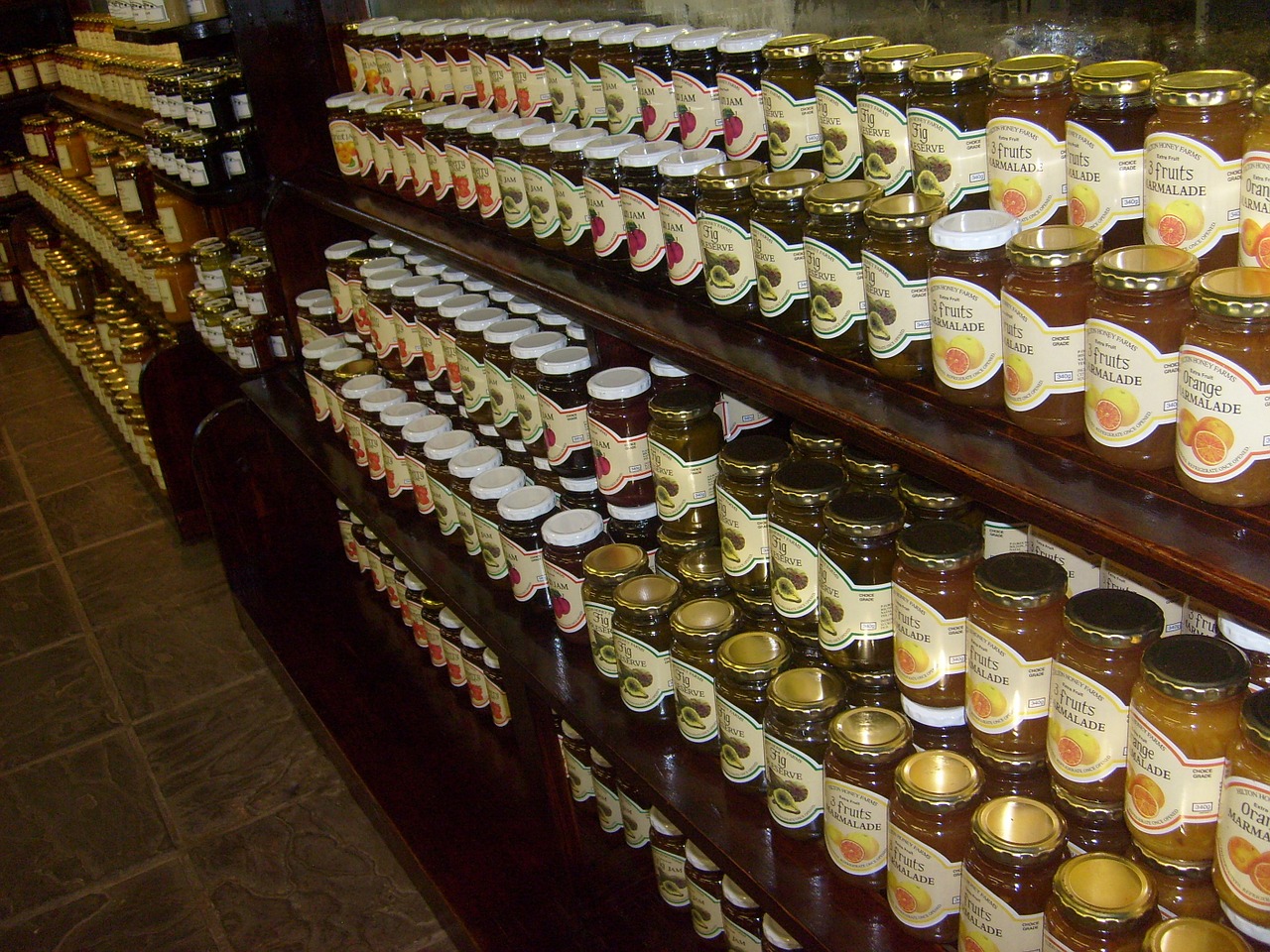
The larger display yielded more interest, but when it came time to buy, people who saw the smaller display were ten times more likely to purchase.
Multiple calls to action can make people feel overwhelmed and unable to focus on completing the action you want them to. And today, we’re engaged in a battle for attention.
Your average visitor is short on time and has an attention span that could make a goldfish cringe.

That being said, there’s also data that shows that many call to actions can work well in some instances. If you are going to use multiple calls to action, make sure one is more prominent than the other.
Make your primary button stand out in size, color or contrast.
You can also make your secondary call to action a lighter color or just a text link.

When a call to action button is sharing real estate with competing buttons, the primary button should be priority.
Your primary CTA should focus attention on the most desired action you want people to take. Share on X5. Limiting your button copy to 2-3 words
The common practice is to keep your call to action phrase short because you don’t have a lot of space. You need to get straight to the point. Tell them exactly what you want in as few words as you can.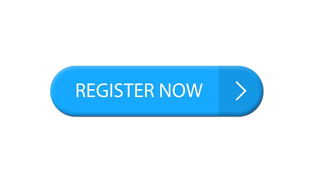 But a phrase that you write on your call to action button should also communicate the benefit a visitor will get once she clicks. And that may take more than a couple words.
When writing your button phrase, a great rule of thumb from Joanna Wiebe of Copy Hackers is to make your button copy complete this sentence:
I want to ______, or
I want you to ______
Put yourself in your visitor’s shoes and express the value they’ll get when they choose your product or service.
Imagine you have a website that offers a free trial of your product. You could make your phrase “Get free access for 30 days” vs. “Sign up now.”
Copy Hackers also cautions against using friction words that are often found in calls to action like:
- Buy
- Sign Up
- Submit
- Give
- Invest
- Donate
- Sponsor
- Support
- Complete
These words can make people feel they have to give up something to get your offer. Call to action phrases without a benefit like “Buy now” should only be used if your visitor is already set to take action.
The first word of your call to action is also important, so make it actionable and something your visitors will understand instantly.

“Get” won’t steer you wrong because people always have good feelings about getting things.
And when it comes to choosing pronouns, 2 stand out above the rest:
- your
- me
These are included in the middle of the call to action. For example, “get your ____,” or “give me ____.”
Other possessive nouns like “I” and “my” work well too.
The important takeaway is to focus on mentioning the visitor specifically. According to the principle of loss aversion, if you make someone think something is already theirs, they won’t want to lose it.
Michael Aagard of Content Verve shared a study in which he discovered that changing button text from second person (“get your free template”) to the first person (“get my free template”) resulted in a 90% increase in clicks!

Also, notice in this test how long the button copy is compared to the commonly recommended 2-3 words. Test a longer call to action phrase, you might be surprised at the results.
If you’re still on the fence though, start with a simple call to action button and improve on it from there.
Use A/B testing to discover what color, size, copy etc. will work better for your offer and audience. So get out there and start testing! You could see some significant improvements if you do.
Are there other ways to sabotage a call to action button that I didn’t touch on? Let me know in the comments below, and I’ll update the post with the best insights (and a link crediting you).